How Color Influences e-Commerce Conversions9 min read
Table of Contents
What’s your favorite color?
That’s a question we often ask people to get to know them better. When it comes to the choices we make every single day, it is surprising to see how many of those are influenced by color. It is no accident that Coca Cola is the leader in carbonated beverages- the vivid red is a call to action by itself!
The Institute of Color Research says that anywhere up to 90% of all shoppers make choices subconsciously, influenced heavily by the colors they see on a medium before choosing to buy on it.
To understand just how much influence color has on perception, we only need to look as far down the road as the nearest McDonalds. The two golden arches with a characteristic red backdrop are recognizable around the world as the place for a quick meal.
The golden arches we see today were designed by Heye and Partner GmbH, but the original design belongs to the first architect who designed the McDonald’s franchise store with two yellow arches to represent a place where everyone was welcome. That stands true even today, as hungry travelers around the globe keep an eye out for the unmistakable yellow.
Color has a way of making everything better, and every day, we discover something new about just how much of an impact color has on our choices. It only makes sense, then, that e-commerce retail brands should, and do, think of color as a core element of their site design.
ASOS.com, for example, has a palette dominated by white and accented with grey and gold which not only serves as a clean contrast but also represents a degree of sophistication that matches the typical ASOS customer. White is often used as the color of transparency and full disclosure, which explains why Apple loves its whites so much.
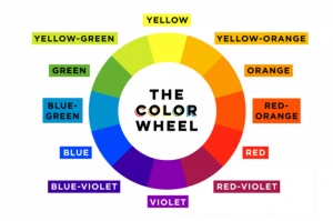
Cool Color theory
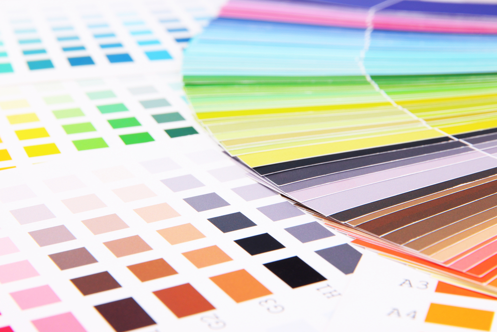
Light colors and earthy tones have a very clean, minimal appeal to them. They remind us of nature and freshness. Indeed, different shades of the same color can have very different impacts on people’s brains, and these are the subtleties that every designer should manage to capture.
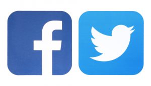
For example, light blue is the color of melancholy and is usually not preferred by retail outlets, but certain social media platforms like Facebook and Twitter have managed to attract millions of people, and their logo and interface are all blue.
Likewise, if you were to have a website for a bakery, browns are mostly preferred, perhaps because they are the color of bread. When used well, brown can evoke a sense of trust and guarantee, which is something we’d all expect from our bread, wouldn’t we?
But, there’s a fundamental question here for us to answer. How did our vision become so keenly perceptive that we can distinguish between red that signifies danger versus another tone of red that signifies immediate action? Less than 90 million years ago, we were equipped with better night vision than we have today, and we say anything that moved in the night in shades of red. This probably explains why the sight of anything in red catches our attention even today- it could be dangerous.
But at the same time, seeing a moving object in red prompts us to do something about it! It is safe to say that the same instinct for warding off danger has now been mellowed down into a more definitive urge to buy something instead.
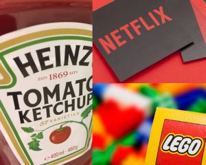
Brands like LEGO, Heinz, and Netflix use powerful reds to tell people to come to them. A bottle of Heinz ketchup is far easier to spot in an aisle than any of its competitors. And if you’re looking for an online example, look no further than YouTube, or the omnichannel footwear brand Vans.
e-Commerce brands with a large and diverse catalog looking to attract the impulsive buyers have to look no further than the color read to truly send across the message.
How Agencies Choose Colors
One main element of brand design is a decision on the brand colors. Agencies spend plenty of resources coming up with the perfect color palette for every brand and what it chooses to represent. When you see green as a dominant element of design in food packaging, it is just reinforcing centuries of research on how we react to different colors.
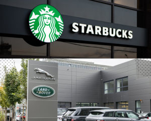
For example, Starbucks has a typical green logo that represents the freshness of the coffee. Combine this with a customer’s sense of smell and that becomes the perfect start to a morning. Curiously, even Land Rover uses green, but this time, it is a way to represent how its fleet is best suited to the outdoors. If you haven’t taken a Range Rover up a mountain, you haven’t done anything with it at all!
At the agency level, the choice of brand colors is based on the inputs that people from the brand provide. What are the company’s core values and beliefs? What does the brand want to achieve with its offering? What are the market standards for similar offerings? All of these aspects are taken into consideration.
Closer home, why do all luxury fashion and sports brands almost always have black logos and type? This is because black is a color of business and professionalism. Moreover, these are the brands that have become iconic in the minds of people, so it makes sense for them to put their brand at the forefront and keep all of the embellishments to a minimum. The same goes for digital media too- both Chanel and Louis Vuitton have e-commerce websites that are predominantly black and white.
However, fast fashion retailers have a slightly different take on the subject. We discussed earlier that red is the color of impulse and is best suited to large catalogs, and H&M understands that very well. Both Zara and Stradivarius take a more journal-style approach to their e-commerce store with dominant greys and blacks which suggest that all of the information is out there for the consumer to evaluate.
However, an agency’s choice of the color palette is influenced not just by what we see in the foreground but in the backdrop as well. Perhaps a better way to spot the secondary colors is to visit the brands’ Instagram handles and look for creatives that have been designed from scratch. For example, Lush Cosmetics is a riot of color, but it is easy to spot how the brand also falls back on black and white for evoking the sense of luxury and uniqueness associated with their products.
The Traditionalists And The New-Age Remodelers
In fashion, it is virtually impossible to escape the black and white. However, brands with a grunge appeal like Levi’s, Lee Cooper and Diesel often fall back on the reliable reds. Emerging brands are in luck as customers too have become more experimentative these days. Allbirds, for example, uses brown, all-natural packaging to go with its product theme. When brands take a radical approach like this one, other design elements often chip in. Allbirds also has very interactive packaging as opposed to the traditional boxes that shoes come in and this design element sets it apart and connects it to the audience that is almost always online.
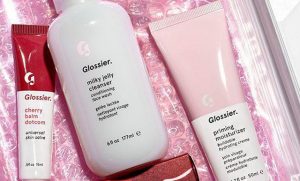
Popular e-commerce beauty brand Glossier, too, has stepped into completely new territory when it comes to the use of color. As opposed to Sephora’s black and whites, Glossier uses a very mild shade of pink, and it works. From the product packaging to the shipping carton, most things are pink and reusable.
Principles Of Color Marketing
For brands looking to stand out and sell better online, there are two things to consider- color combinations derived from the brand’s belief and value systems, and choices based on common consumer perceptions.
Yellow is a color least often used in the online context because it presents some practical issues such as how it appears on different screens. Since shades of yellow by themselves are rather odd to look at, any brand looking to use the color must consider it in contrast with another, more dominant color. Green and blue may not be ideal colors for brands selling apparel as they tend to overpower everything else. However, these make very good choices for brands selling beauty products as Nivea has discovered to great delight. Green, in particular, is a color best suited to represent the products of natural origin.
Shades of pink are predominantly the domain of lingerie and Victoria’s Secret held a near-total monopoly on the color for the longest time. However, brands like Glossier are finding ways to use it creatively to come across as a brand that is easy to approach, which is quite in contrast to what it represented for the famous lingerie brand- aspiring to a higher goal.
White, is a favorite among fashion and lifestyle brands alike. Lancome, Cartier, and Burberry all use a reservoir of whites across all media, including their websites. It is also worth mentioning that white is a great color for websites and web stores because it provides the perfect base against which products can truly stand out. When in doubt, always use white.
How can we best use these colors on websites to encourage checkouts? Brands with dominant colors like red and green should consider using them to highlight the call to action buttons while keeping the rest of the page neutral. This way, customers immediately know what to click on, thus encouraging their impulses. At the same time, too much use of these colors can be jarring on the eye.
Once a palette is in place, it is important to use design principles to come up with ways to use the colors without making them overpowering. Approaches like A/B testing the e-commerce store, doing physical surveys of how people react to the website, etc. can help immensely in the soft launch phase. In general, it is better not to use more than three main colors for a website, and to keep the backgrounds in a single color to avoid confusion and overwhelming the senses. With color, less really is more!
Above all, humans perceive colors as emotions. For the thinking brain, colors inflict impulses and impulses inflict actions. With the right colors, brands and businesses can really reach out and make a connection with their audience.
Read More About Automated Catalog Management Solution
ABOUT THE AUTHOR